
Ernesto Cánovas: Matisse Bookshelves

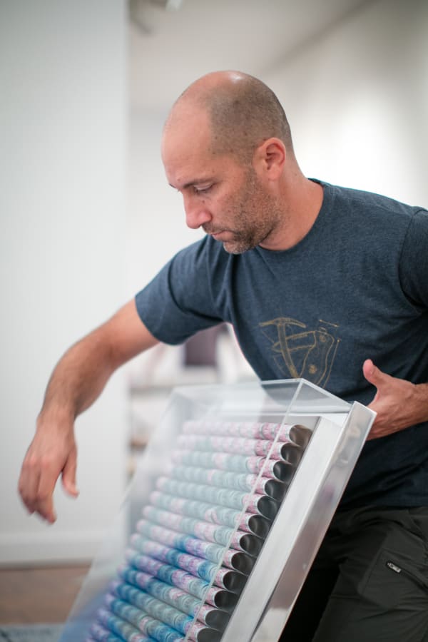
Following photographic manipulation, Cánovas screenprints the digital media onto either aluminium or wood panels. This process achieves wavering effects due to the grain of wood or the way each panel is buttressed together. In one of his earliest works, Black Forest (2012), the horizontal grain is especially distinct against its muted background. The deeper incisions and grooves of the wood appear as prominent yellow lines since no paint is absorbed into their crevices. This renders the artwork organic, as though the marks generated are the lifelines of the painting’s surface. These lines form part of the painting’s inherent memory; alongside the source material used and Cánovas’ distortive process, the screenprinting technique results in part of the image being lost, further deconstructing it.
Thereafter, Cánovas uses a plethora of drawing and painting techniques and begins the process of building up layers of acrylic, ink, and varnish to create a sense of depth, while still allowing an ‘essence of the [original] image’ to show through. Alejandro Martín, art director and curator at the Espronceda Centre for Art and Culture in Barcelona, lauds his capacity to blend ‘noble’ materials like wood, aluminium, marble, and ceramic alongside more industrial ones: plastic, rubber, and miscellaneous metals. He also argues that Cánovas’ work is ‘sensory’ – made so by his ability to expand two dimensional images into three, via his articulation of light within them.

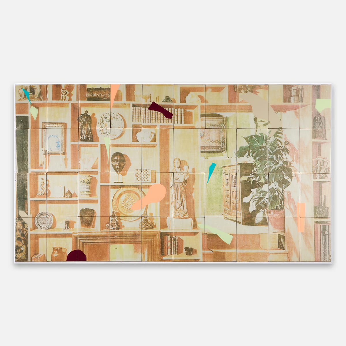
The present work, that features in In Plain Sight, ties many of Cánovas’ previous experiments into one work. Matisse Bookshelves (2023) overtly references Cánovas’ long-held interest in Matisse. Its title prescribes the painting a meaning – this work becomes a portrait, a repository, even an archive for Matisse’s influences. We are invited to fashion our own assumptions about the inclusion of many of its elements, from the maquette of the Farnese Hercules, to the luscious monstera plant reminiscent of his cut-outs. Though denied figure, the painting offers an insight into the fabricated mind of one of Cánovas’ greatest inspirations. Cánovas, having attended the Tate Modern exhibition Henri Matisse: The Cut-Outs in 2014, is said to have been taken by Matisse’s interest in colour. He was particularly interested in The Snail, and in colour’s capacity to ascertain composition. Much like in Matisse’s artwork, Cánovas’ Matisse Bookshelves has put many brightly coloured flat areas into his domestic scene. Not only are these intended to enliven the composition, but they also serve as a reminder of the work’s medium and challenge our perception of what lies beneath them. Much like how Matisse’s The Snail constructs a narrative in two-dimensional space, Cánovas works on multiple planes to invite thought and response to his pictorial planes.

While Cánovas’ work has a strong and recognisable aesthetic, his creative process has evolved over the years. His series Botanic is redolent of the photograms, or ‘Rayographs’ produced by Man Ray in the 1920s. Photograms result from light exposure experiments, where light-sensitive material captures the essence of an object’s presence without a camera; objects are placed on the surface, causing light to stain the sheet in areas of the objects’ absence. Man Ray’s Rayograph (1923-1928) shares similar attributes with Cánovas’ Botanic I and Botanic III (2017). In each case, there is a shadowy implied sense of form, coupled with blurred silhouettes that evoke a sense of place. While Man Ray’s experiments are only greyscale, Cánovas incorporates colour, allowing us to fabricate a better understanding of the subject matter. Both artists pay special attention to light in their compositions, comprising areas of piercing brightness, reminiscent of long exposure photography or old grainy film. Their mutual focus examines how light shapes our understanding of space.

Further experiments by Cánovas explore colour-field abstraction, akin to the work of Gerhard Richter or Mark Rothko. Though part of the same series mentioned, Botanic V assumes a disparate aesthetic, with its entire aluminium surface constituting a pink-orange gradient. Not relying on figuration in the same way as Botanic I or III, these works instead lean into their process of creation, dictating emotion and sense of place via colour. In titling the work the same as the works listed above, Cánovas offers us one further frame of reference – we are invited to view this work too as a botanical fragment: perhaps a close-up of a flower, or perhaps under the layers of colour there is a photogram waiting to be uncovered.

